Cara Membuat Dark Mode fitur Malam di blogger atau di website
31 Jan 2021
1 Komentar
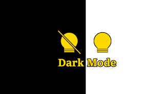 Mode malam (gelap) atau dark mode, saat ini sudah banyak digunakan di blogger maupun di website, karna fungsi dari dark mode itu sendiri bisa merubah warna yang tadinya tampilan atau teks berwarna putih berubah menjadi gelap dan juga sebalinya, fitur ini cukup membantu ketika di malam hari agar mengurangi kerusakan mata karna cahaya yang berlebihan dihasilkan dari layar handphone atau desktop.
Cara memasang Dark Mode (mode gelap) ini untuk Blogger:
1). Masuk Ke blogger kalian
2). Pilih Menu Tema lalu klik Edit Html
3). Cari ]]></b:skin> jika kesulitan menemukan kode itu. tekan Ctrl + F untuk membuka kotak pencarian dan tuliskan kode tadi dan tekan Enter
jika sudah ketemu pastekan kode dibawah ini tepat diatas/dalam kode CSS
/* Dark Mode By https://ztncoding.blogspot.com */
.modedark{display:inline-block;margin-top: -10px;position:relative;left: 0;top: 0;z-index:999;}
.modedark svg{
width:24px;
height:24px;
vertical-align: -5px;
background-repeat: no-repeat !important;
content: '';
}
.modedark .check:checked ~ .NavMenu{
opacity:1;
visibility:visible;
top:45px;
min-width:200px;
transition:all .3s ease;
z-index:2;
}
.iconmode {
cursor: pointer;
display: block;
padding: 8px;
background-position: center;
transition: all .5s linear;
}
.iconmode:hover{
border-radius: 100px;
background: #fff radial-gradient(circle, transparent 2%, rgba(0,0,0,.2) 2%) center/15000%;
}
.check {
    display: none;
}
.modedark .iconmode .openmode{
display:block;
}
.modedark .iconmode .closemode{
display:none;
}
.modedark .check:checked ~ .iconmode .openmode{
display:none;
}
.modedark .check:checked ~ .iconmode .closemode{
display:block;
}

/* Dark Mode */
.Night #wrapper {background: #292e38;}
.Night #HTML3 {background:#1d2129;}
.Night #footer-widget-container {background:#1d2129;}
.Night .share-this-please {background:#292e38;}
.Night .related-post h4{background:#292e38;}
.Night #label-info-th {background:#1d2129;}
.Night body {background:#1d2129;}
.Night .post-body {color:#cccccc}
.Night #baca-juga h2 {color:#cccccc;background:#1d2129}
.Night .label-info-th a {color:#cccccc;background:#3d4658}
.Night li.recent-posts a{color:#cccccc}
.Night .recent-posts-title h2{color:#cccccc}
.Night .Recent_Post .recent-post span.title a{color:#cccccc}
.Night span.title a .Recent_Post .recent-post {color:#cccccc;background:#1d2129}
.Night .Recent_Post .recent-post .widget-content {color:#cccccc;background:#1d2129}
.Night .post-info {color:#cccccc}
.Night {background:#1d2129;}
.Night h2.post-title a {color:#9e9e9e;}
.Night h2.post-title a:hover {color:#f17f43}
.Night .post-title {color:#1e90ff}
.Night ul.nav-social {color:#1d2129}
.Night .post-snippet {color:#cccccc}
.Night #ignielNewsletter {background:#292e38;}
.Night #Label1{background:#292e38;}
.Night .post{background:#292e38;border-bottom-color: #252a33;}
.Night .PopularPosts h2{background:#343944;}
.Night .latest-post-title h2{background:#292e38;border-bottom-color: #313640;}
.Night .newspaptext{color:#9e9e9e}
.Night .PopularPosts h2 span{color:#9e9e9e}
.Night .list-label-widget-content ul li {border-bottom-color: #313640;}
.Night .img-thumbnail img {background: #252931 linear-gradient(to right, rgba(255, 255, 255, 0) 5%, rgb(49, 54, 64) 20%, rgba(255, 255, 255, 0) 30%);background-size: 800px 104px;}
.Night #ignielNewsletter .medsos__ {border-top-color: #313640;}
.Night #footer-container{background:#12161f;}
.Night #footer-navmenu{background:#171b25;}
.Night .sidebar h2 {color:#b7b7b7;border-bottom-color: #313640;}
.Night .sidebar-sticky h2 {color:#b7b7b7;border-bottom-color: #313640;}
.Night .latest-post-title h2 {color:#b7b7b7;border-bottom-color: #313640;}
.Night .above-post-widget h2 {color:#b7b7b7;border-bottom-color: #313640;}
.Night .comments h3 {color:#b7b7b7;border-bottom-color: #313640;}
.Night .breadcrumbs {color:#b7b7b7;border-bottom-color: #313640;}
.Night .btnsocialshare {background:#383c44;}
.Night .label-line::before{background: #1d2129;}
.Night .label-line-c::before {background: #333740;}
.Night a.showcontent:hover {background: #373a42;}
.Night a.showcontent{background: #292e38}
.Night #ignielNewsletter input{background: #272b33;border-color:#2b303a;}
.Night .comments .comments-content .comment-content {color:#ffffff}
.Night div#Label1 h2 {border-bottom: 1px solid #272b33;background: #343944;}
.Night .related-post-style-3 .related-post-item-title {color: #bbb;}
.Night #baca-juga ul {border: 2px solid #333740;}
.Night #baca-juga h2 {border: 2px solid #292e38;}
.Night #comments a.hiddencontent {background: #424854;}
.Night .comments .comments-content .comment-thread ol {background: #292e38;}
.Night .comments .comments-content .inline-thread {background: #292e38;}
Selanjutnya Cari
JavaScript
<script>
//<![CDATA[
/* Dark Mode By ZTN CODE */
$(document).ready(function(){$("body").toggleClass(localStorage.toggled),$("#modedark").on("click",function(){"Night"!=localStorage.toggled?($("body").toggleClass("Night",!0),localStorage.toggled="Night",$(".section-center").css("display","block")):($("body").toggleClass("Night",!1),localStorage.toggled="",$(".section-center").css("display",""))}),$("body").hasClass("Night")?$("#modedark").prop("checked",!0):$("#modedark").prop("checked",!1)});
//]]>
</script>
Terakhir letakan kode
HTML
<div class='modedark'>
<input class='check' id='modedark' title='Mode Dark' type='checkbox'/>
<label class='iconmode' for='modedark'>
<svg class='openmode' viewBox='0 0 24 24'><path d='M12,2A7,7 0 0,0 5,9C5,11.38 6.19,13.47 8,14.74V17A1,1 0 0,0 9,18H15A1,1 0 0,0 16,17V14.74C17.81,13.47 19,11.38 19,9A7,7 0 0,0 12,2M9,21A1,1 0 0,0 10,22H14A1,1 0 0,0 15,21V20H9V21Z' fill='#FFFF00'/></svg>
<svg class='closemode' viewBox='0 0 24 24'><path d='M12,2C9.76,2 7.78,3.05 6.5,4.68L16.31,14.5C17.94,13.21 19,11.24 19,9A7,7 0 0,0 12,2M3.28,4L2,5.27L5.04,8.3C5,8.53 5,8.76 5,9C5,11.38 6.19,13.47 8,14.74V17A1,1 0 0,0 9,18H14.73L18.73,22L20,20.72L3.28,4M9,20V21A1,1 0 0,0 10,22H14A1,1 0 0,0 15,21V20H9Z' fill='#FFFF00'/></svg>
</label>
</div>untuk website hampir sama namun dibagian CSS letakan diatas/dalam
Untuk menerapkan fitur ini memerlukan jquery versi 3 ke atas, jika blogger atau website kalian sudah terdapat jquery versi ke 3, lewati bagian ini, namun jika belum letakan diatas/dalam
jQuery
<script src='//ajax.googleapis.com/ajax/libs/jquery/3.4.1/jquery.min.js'/>Menambahkan fitur bintang jatuh, tambahkan kode
CSS
/* Dark Mode By https://ztncoding.blogspot.com */
.section-center{
    position: fixed;
    width: 100%;
    height: 100%;
    top: 50%;
    left: 50%;
    display: none;
    overflow: hidden;
    z-index: 5;
 pointer-events: none;
    box-shadow: 0 0 50px 5px rgba(255,148,0,.1);
    transform: translate(-50%, -50%);
}
.section-center {
    -webkit-transition: all 500ms linear;
    transition: all 500ms linear;
}
.shooting-star {
 z-index: 2;
 width: 1px;
 height: 50px;
 border-bottom-left-radius: 50%;
 border-bottom-right-radius: 50%;
 position: absolute;
 top: 0;
 left: -70px;
 background: linear-gradient(to bottom, rgba(255, 255, 255, 0), white);
 animation: animShootingStar 6s linear infinite;
 -webkit-transition: all 2000ms linear;
 transition: all 2000ms linear;
}
.shooting-star-2 {
 z-index: 2;
 width: 1px;
 height: 50px;
 border-bottom-left-radius: 50%;
 border-bottom-right-radius: 50%;
 position: absolute;
 top: 0;
 left: 200px;
 background: linear-gradient(to bottom, rgba(255, 255, 255, 0), white);
 animation: animShootingStar-2 9s linear infinite;
 -webkit-transition: all 2000ms linear;
 transition: all 2000ms linear;
}
.star {
 z-index: 2;
 position: absolute;
 top: 185px;
 left: 25px;
 background-image: url('https://ivang-design.com//svg-load/air/star.png');
 background-size: 15px 15px;
 width: 15px;
 height: 15px;
 opacity: 0.4;
 animation: starShine 3.5s linear infinite;
 -webkit-transition: all 1200ms linear;
 transition: all 1200ms linear;
}
.star.snd {
 top: 100px;
 left: 310px;
 animation-delay: 1s;
}
.star.trd {
 top: 130px;
 left: 100px;
 animation-delay: 1.4s;
}
.star.fth {
 top: 190px;
 left: 200px;
 animation-delay: 1.8s;
}
.star.fith {
 top: 85px;
 left: 1080px;
 animation-delay: 2.2s;
}

@keyframes animShootingStar {
 from {
  transform: translateY(0px) translateX(0px) rotate(-45deg);
  opacity: 1;
  height: 5px;
 }
 to {
  transform: translateY(1280px) translateX(1280px) rotate(-45deg);
  opacity: 1;
  height: 800px;
 }
}
@keyframes animShootingStar-2 {
 from {
  transform: translateY(0px) translateX(0px) rotate(-45deg);
  opacity: 1;
  height: 5px;
 }
 to {
  transform: translateY(1920px) translateX(1920px) rotate(-45deg);
  opacity: 1;
  height: 800px;
 }
}

@keyframes starShine {
 0% {
  transform: scale(0.3) rotate(0deg);
  opacity: 0.4;
 }
 25% {
  transform: scale(1) rotate(360deg);
  opacity: 1;
 }
 50% {
  transform: scale(0.3) rotate(720deg);
  opacity: 0.4;
 }
 100% {
  transform: scale(0.3) rotate(0deg);
  opacity: 0.4;
 }
}
selanjutnya letakan kode dibawah ini tepat diatas/dalam kode
HTML
<div class='section-center'>
 <div class='shooting-star'/>
 <div class='shooting-star-2'/>
 <div class='star'/>
 <div class='star snd'/>
 <div class='star trd'/>
 <div class='star fth'/>
 <div class='star fith'/>
</div>
keren mas
BalasHapus